Warning: If you click on any of the links below, you will be amused — then you will be annoyed to discover that the UI you use every day is shit.
I wanted to complain about how bad User Interface (UI) and User Experience (UX) has become the last decade, or two. Then I found out that people already to this — so I don’t have to.
But I still want to complain. Because UX,for the most part, is horribly broken. But again, most examples are already covered by the mentioned website, so go there, see for yourself.
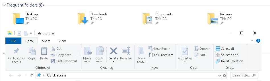
Like, what happened to borders and contrast? I can’t see where one window ends and another begin. There is no border, and the titlebar — the one with the text “File Explorer” in it — is white, just like the background of the window behind it.
Contrast used to be a thing. But at least it is “on brand” for Windows.
And while we are on the topic, what about some dark patterns? It’s when developers actively try to mislead you into something. Like this: Ryanair dark UX patterns.